
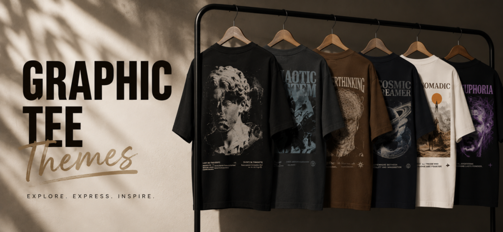
Anime, Marvel, or Venom: How to Pick a Graphic Tee That Matches Your Style
A graphic tee lives or dies on two things most people don’t think about until the shirt’s already faded: print technique and placement. The theme gets you to click “add to cart” — the execution is what decides whether the shirt still looks good in six months.
What makes a graphic tee “streetwear” instead of just a printed t-shirt?
It’s not the image — it’s how it’s applied and where. Streetwear graphic tees typically use screen printing or DTG (direct-to-garment) printing that’s cured to resist cracking, placed either full-chest, back-print, or oversized-front in a way that reads intentional against an oversized silhouette. A cheap heat-transfer print on a regular-fit tee is a different product entirely, even if the artwork looks similar in a product photo.
What to look for in print quality and fade resistance
The tell is texture, not color. Run a finger across the print — a well-cured screen print sits slightly raised but flexible, not stiff or plasticky. A print that already feels thick and rubbery out of the box is more likely to crack after a handful of washes. Ask or check whether prints are washed-tested before you buy, especially for detailed line-art styles where cracking shows up fastest.
Licensed vs. fan-inspired prints — what’s the difference for durability and legality
Officially licensed graphics go through quality control from the IP holder and typically hold up better long-term because the print files are optimized for garment printing. Fan-inspired or fan-art-style graphics that reference a theme without using protected characters or logos avoid licensing complications but vary more in quality depending on the printer. If a brand’s listing doesn’t explicitly say “officially licensed,” assume it’s fan-inspired styling rather than a licensed product — worth checking before you buy if authenticity to a franchise matters to you.
Who minimal versus bold graphic themes are for
Some themes lean toward big, high-contrast statement prints — full-chest or back-print pieces meant to be the focal point of the outfit. Others lean minimal — a small chest logo or subtle line-art placement that works closer to a plain tee with just a hint of personality. Neither is “better”; it’s a question of whether you want the shirt to lead the outfit or support it.
When does a bold slogan work better than an illustration?
Typography-led tees read as more versatile day to day, since a slogan is easier to style both up (front-tucked, smart-casual) and down (loose, streetwear) than a large illustration, which tends to commit the whole outfit to one lane. If you only want to own one or two graphic tees, a strong typography piece stretches further across occasions than a highly specific illustrated theme.
How do I pick a graphic theme if I only own one oversized tee?
Go with whichever theme you’d still want to wear in a year, not whichever is trending this month — illustrated themes tied to a specific show or franchise date faster than a typography or minimal-line-art design. If versatility matters more than making a statement, typography or a subtle graphic wins; if you want the shirt to be the outfit, go bold.